

10 April 2020
Communication designing.
Design problems in Ashokan IXth edict.

Ashoka the great had several edicts in his empire. There are about 14 rock edicts and 7 pillar edicts currently present.
Edicts were written in local language. They are a main source of information about the reign of Ashoka.
Most of the Ashoka’s edict written in Brahmin Script were discovered by James Prinsep, a British official in 1837.
Of which his IXth edict had several evidences of special occasions. This is an interpretation of the problems associated with this edict with the aspect of communication designing. The script of the edict is Mauryan Brahmi. Though it was not clearly carved. The stone on which the script was carved was uneven. It was also asymmetrical. The text was randomly carved and scattered all over the edict. It took a lot of efforts to actually carve the script over the stone. This edict is the testimony of the mission to spread Buddhism in western India. It also gave a lot of importance to men. These inscriptions maybe carved on stone, pillars, rock slabs. The typography, typeface, font, colours, consistency, appearance, leading and alignment was not much taken care of. The script carved on stone was anonymous and wasn’t clear to understand. The spacing wasn’t consistent and the kernel and leading didn’t match the typography all over the edict.
Rather than attract attention, this kind of text just needs to be clear and easy to read. Part of it has text arranged in a way that makes it difficult for the eye to navigate, considering things like font size, tracking, leading, etc.
Unfortunately, even unintentional errors can make these edicts look unprofessional and possibly give audience a negative perception of the message.
Although carved typography is no easy feat, but it’s one that can be enjoyed by paying attention to a few particulars and finished specialized tools. Considering some of the modest design tips and cultivate a good design eye helps in long run. Question the defaults and usability and solving a problem is a major requirement. And always feel free to deliberately break a design rule, so long as you break it with intention and looks good to eye with no readability issues.
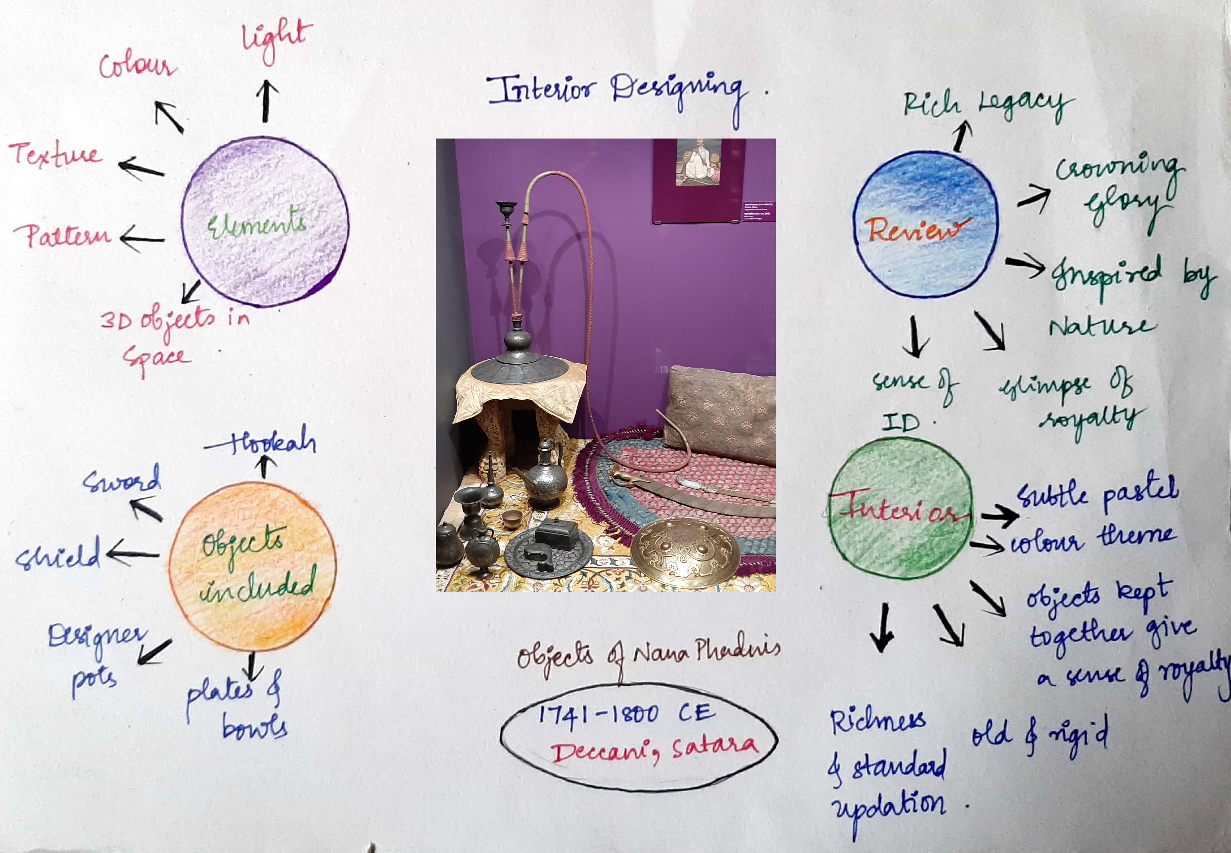
Interior design
Design intervention on nana phadnis objects.

Objects often tell a story deeper than what meets the eye. This is a design intervention for the objects of Nana phadnavis with the aspect of interior design.
To ensure a space is visually appealing, elements of colour, texture, shape, pattern, objects, line and texture come into play. They give a great sense of interior designing.
Nana phadnis objects included hookah pot, attar sprinkler, swords, shields, pots, plates and bowls. The use of hookahs from ancient times in india was not only a custom but a matter of prestige. Only rich and landed classes would smoke hookahs.
The swords and shields were used at the time of war and hence were supposed to be stiff, strong and tensile.
These complementary foundations of interior design work together to create a seamless space that ignites the senses without you even knowing it.
Texture in interior design refers to the surface quality of a material. Each of these materials had varied textures on it. One can improve the texture and colour theme in this existing design cultural objects without disturbing their purpose/use.
Visual textures are those that immediately appeal to your visual sense on first glance.
Bring in the intricate texture and feel the objects. These days there is a huge demand for natural textural elements.
We being tactile, touch makes us feel good, releasing the hormone oxytocin.
With so much of our time being spent touching the shiny smooth screens and devices, our sense of touch has deprived for too long.
There is a lot of importance of presence of objects and this helps in designing space.
The new decade will see a drive for an individual stamp to design based on reflections from our heritage and this will give a sense of who we are. The new objects with ancient references and intricate textures gives the object a next level experience with great purpose.
By adding this exciting additional sense, we tend to add new dimensions to our design and elevate them by bring them to life like a black and white picture being reworked in colour.
Reflections.
Today we had peer review and the above articles are the final drafts after a lot of changes. I referred some online articles and the feedback that my peer gave me.
This project was not so interesting but I gained a lot of knowledge by reading many design intervention articles and studying the typography rules before identifying the design problems in the edict.
