

27 march 2020
So according to the time line I have started working on my aspect of pottery through the era’s and now I have picked up certain objects till 600 AD and I have started making layouts for each page of the coffee table book.
So far I have used adobe illustrator to make the objects digitally and now I have made this individual layouts in adobe Illustrator and further I will arrange all of these in adobe Indesign. So die to the corona virus pandemic I will not be able to take a test print or may be the final print so everything will be evaluated and will be based on online review.
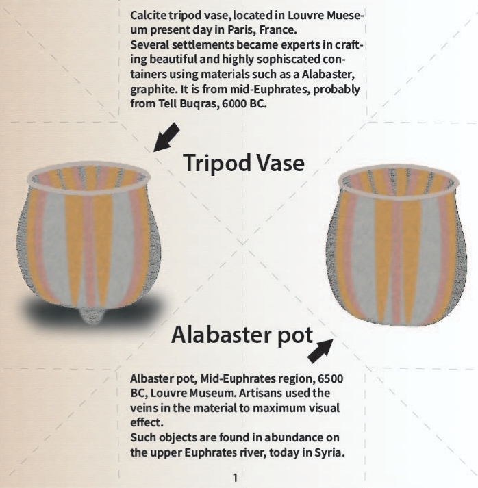
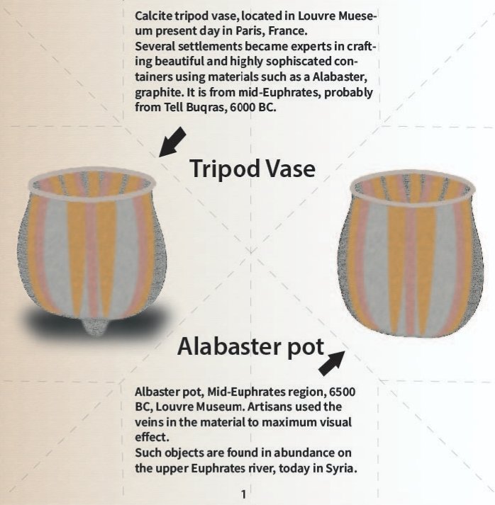
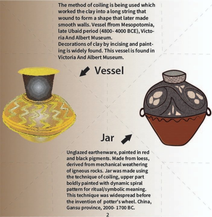
I have not removed the dotted line so as to keep a reference for the folding of the page and I have just reduced the opacity.
Today I actually learnt how to choose the right font though not perfectly but to a certain extent. I have gone through some references online and then used this font for now. I have chosen corbel as the font with size 17.5 and typeface bold.
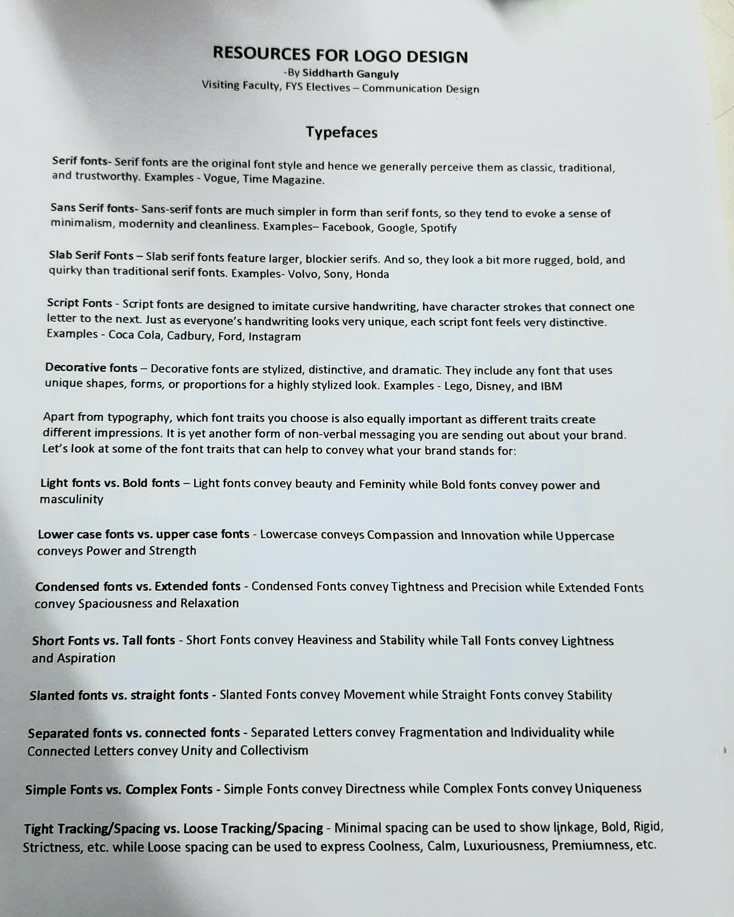
Also during my elective of communication designing with siddhart sir, I have learnt to first classify the fonts and either perceive them as classic, traditional, minimalistic, stylized, masculinity, strength and power.
And sir did like it. I have also added a texture in the background to give a historic feel to it.
I will add some more pages in the front of the book and make a jacket, put up a title, add a introduction page, acknowledgment, table of contents, timeline, bibliography, declaration and index.
I will also include a page where in I’ll describe how I have illustrated all of these objects and the detailed information about the origami concept used in this coffee table book.
At the end I would to end this discussion with the plus point of online lecture that is, even if you wake up 5 minutes before the lecture, you won’t miss the any of the class discussion. This is really kind of helpful in my case!
Stay tuned to see all the layouts of the coffee table book.
