

Different Logo aspects.
Emblem
A singular unit as an identity.
Like shields, stamps, almost creating a cult of sorts.
Eg: Taco bell, LG, FedEx
Monogram
Identities where the abbreviation becomes the hero. It adds the character of the category.
Eg: Starbucks, FedEx ,tacobell
Logo type
Identities where a minimal yet smart tweak in the type of the symbol sends out the story of the brand.
Eg: Starbucks, LG, tacobell
A logo has to be simple, scalable, memorable, can be impractical, versatile, relevant.
In today’s class what I learnt was, whenever a client approaches you for the logo design, listen to the client brief, ask them relevant questions, do your research, know about the brand strategy, complete the ideation ( word/visual mapping and sketching), before final execution and presentation.
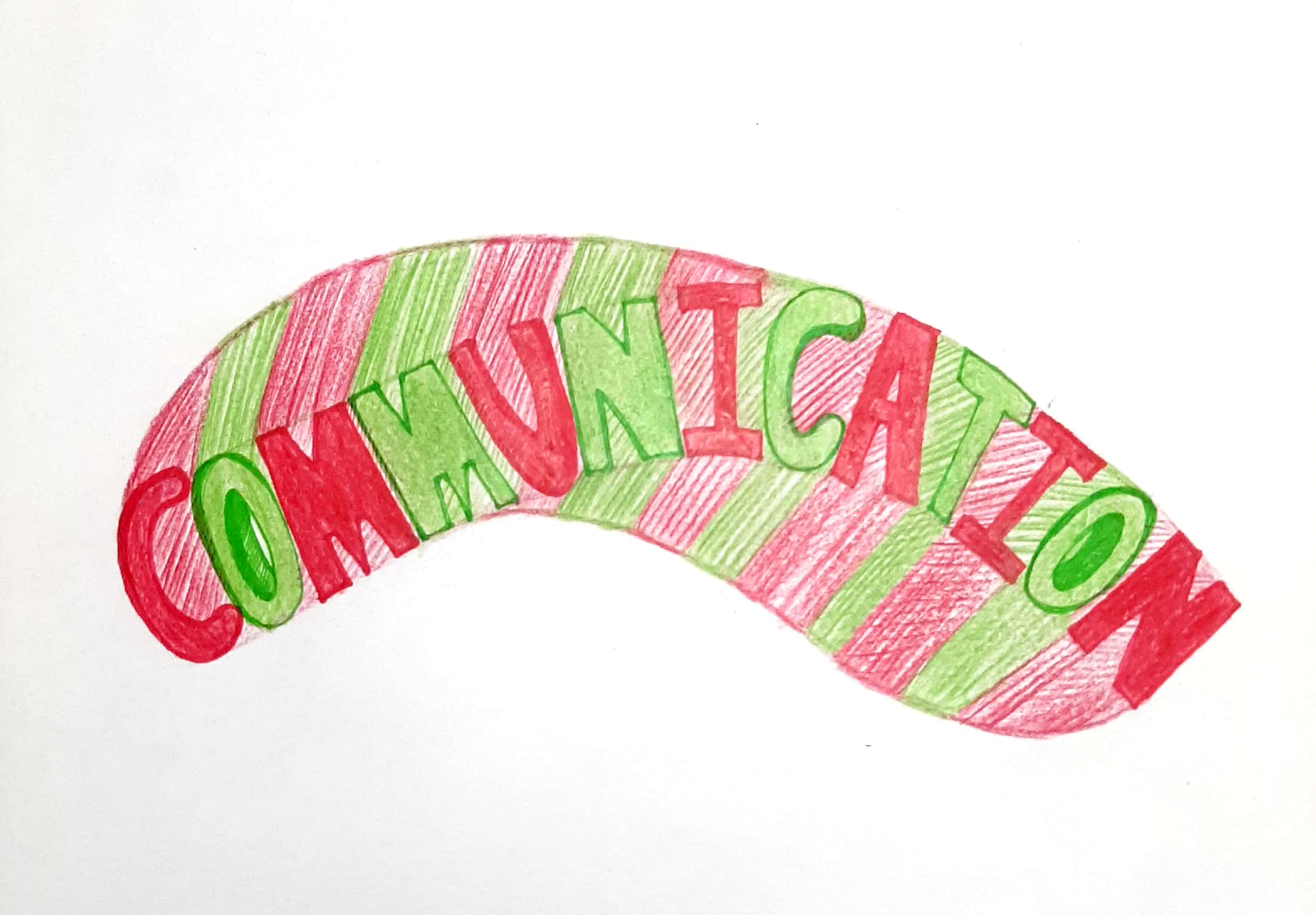
Mind mapping is the first step to start your logo design.
Creative brief for brand identity.
Name of the brand: HALT
Background:
1) category and brand and product offering.
2) what is the task at hand?
Creating a new brand identity.
Consumer.
Who are we speaking to? Target consumer (primary/secondary)?
Brand.
What will be the key brand proposition or USP?
Key differentiation.
Can you describe the brand in one line?
Desired response/ imagery
What is intended brand imagery?
(Premium, mass premium, Luxury, mass)
Deliverables.
Logo, colour pallete, typeface, stationery, any other element of your choice.
Using all these key points, I have made a mind map on peppermint.
Halt to bad breath.


Sir liked this idea, but he told us not to restrict our thinking only to the peppermint brand. So I am planning to add some more brand identities and use all the basics to make another mind map.
