

29 January 2020
Typeface
Type face refers to design (the way it looks)A font is what you use
Typeface is what you see.
Font
Typeface+style+size=font.
☆Serif- classic and timeless
Communication look serious, traditional,authoritative
SEEN IN HSBC, TIFFANY.
☆Sans serif- clean bold and contemporary.
Used in headlines, signage, logos.
Seen in channel, starbucks, fedex.
☆Slab serif – bold. Classic n masculine
Seen in Sony, Mozilla, Volvo
☆Display- decorative n creative
Airaways.
☆Script- personal n classic.
Used in:-
handwritten
Casual
Informal
Invitation
Perfumes
Highlighting
Personalised.
Informal
□Curved extensions called as embellishments.
Common fonts- times new Roman,Georgia, caslon, baskerville,butler.
□Bold and flat slab like embellishments.
Common fonts-
□Clean n simple embellishments
Helvetica, lato, Gotham, Avenir, proxima nova, aria.
□Base liner fonts- sign painter, shelby, sloop, venetian, yellow tail.
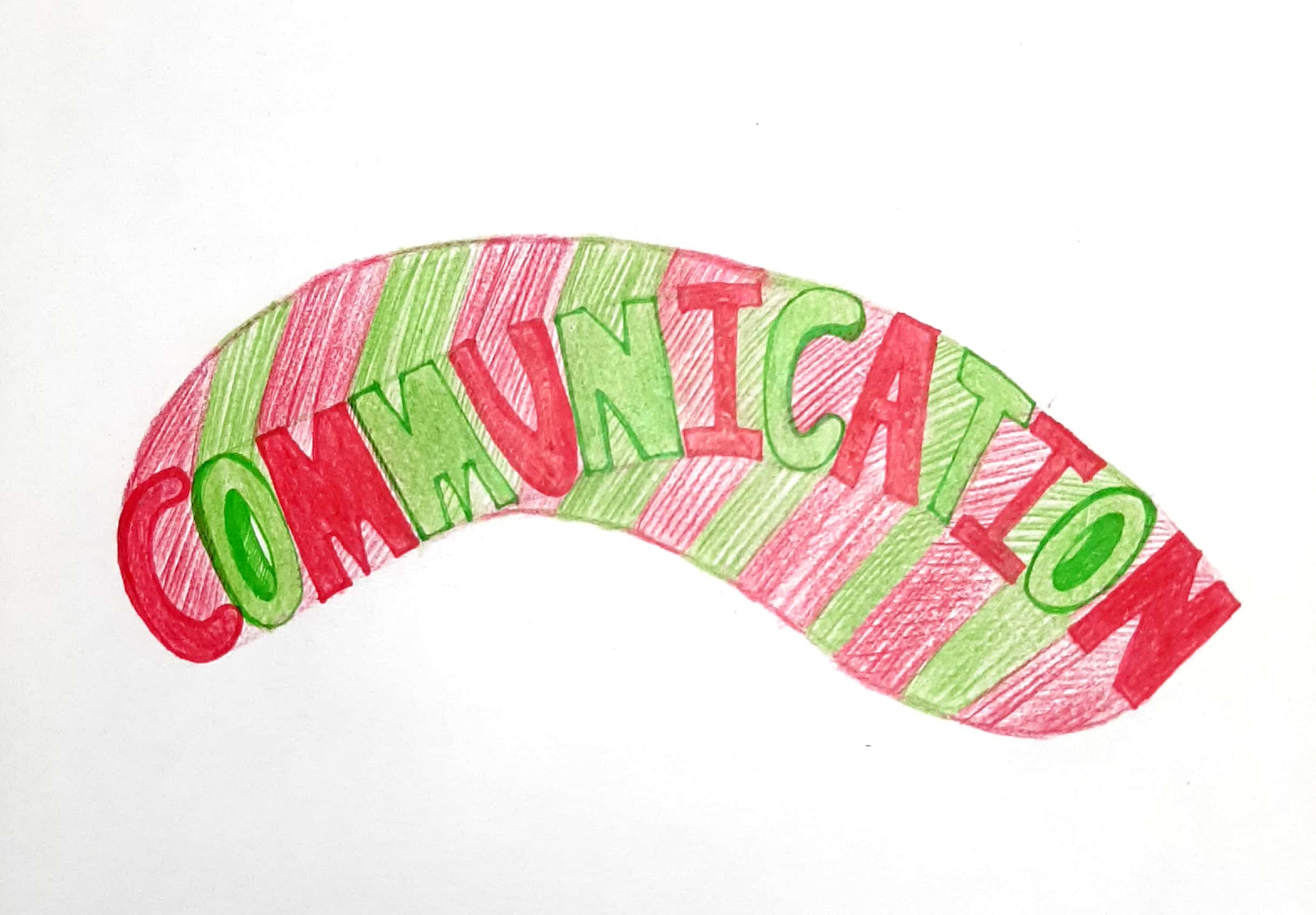
I have started using these fonts as a basis for my new lesson that is lettering. I am trying to make some new typeface by mixing two fonts and coming up with something very different.
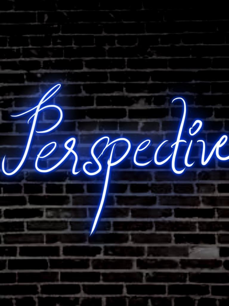
 Here are the two type face that I have made renovating the existing one’s!
I actually had fun playing with only 2 colors and yet communicating vibrancy through my work. Communication designing is really fun!
